Most advice on creating accessible emails centers around ALT text, color contrast, and proper semantic structure. All essential elements for any digital creation to be accessible.
But if you’re a content marketer like me, trying to build emails that actually reach people and drive results, we have to go beyond those checklist items and examine the less obvious accessibility issues. We need to look at the small, often-overlooked barriers that can quickly break the user experience.
Note: Before we dive in, let me remind you. Email clients are unpredictable. What works in Gmail may break in Outlook. Some strip styles. Some ignore semantics. So accessibility in email isn’t about crafting a perfect experience. It’s about designing something that holds up under imperfect conditions.
Optimize for Experience, Not Just Compliance
Most accessibility guidance for email makes it seem like all you have to do is run through an accessibility checklist, validate once, click Send, then move on.
But in reality, your message has to survive countless varying devices, unpredictable email clients, and a wide range of assistive technologies, all while competing with an overflowing inbox.
Let’s look at some of those less obvious potential accessibility challenges that can exclude your readers, and how to fix them in ways that also improve your marketing.
Preview Text vs. Preheader Text
It seems there are varying definitions and opinions about what preview and preheader text are and what their role is in an email.
So, I went to one of the industry leaders in email and email marketing, Litmus from Validity, for clarification.
According to Litmus,
Preview text shows up in the inbox, right after the subject line
Preheader text is the text that shows up in your email above your header area, above your email’s body copy (hence why it’s called preheader in email marketing) ~ Difference between preheader and preview text
For example -
Preview text appears for sighted users in the inbox, next to or below the subject line. It can, sometimes, be announced by screen readers, but that depends on the email client. And, the preview text is not part of the email content itself.
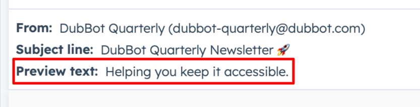
Preheader text is located within the email code; it can be hidden visually, but it is the first thing screen readers read when the email opens. Preheader text is sometimes repurposed as preview text by email clients, leading to those varying definitions and opinions.
What Do These Differences Mean in Terms of Accessibility?
Because screen readers can read both, they should be treated as intentional, user-facing content rather than as default placeholders for instructions such as View this email in your browser. These content elements deliver the first meaningful context of your message to your readers. Approaching them this way not only supports better accessibility but also increases reader engagement, strengthens comprehension, and drives better results.
Scanability is Not Just Visual
Content hierarchy elements, such as headings, spacing, and layout, are critical to creating an accessible email experience.
But accessibility isn’t just about what’s easy to see. It’s about what’s easy to process and understand. Accessible emails don’t just look organized; they help reduce cognitive load.
Email exists in a high-noise environment with overcrowded inboxes and constant competition for attention. Just like on your website, they skim your emails, and they skim fast.
That reality should shape how we think about accessibility. If your message requires too much interpretation, forces too many decisions, or makes the reader work to figure out what actually matters, you’re creating fatigue. And fatigue is a barrier for all of your readers.
Accessible email is about whether your message can be understood quickly, confidently, and without unnecessary effort. And that goes for the body of your email as well. If someone has to reread your sentence to understand it, that’s a barrier and could lead to a lost customer or client.
See the Resources section below for more information on accessible writing and the use of plain language.
Link Consistency is a Trust Issue
Most email accessibility advice stops at the familiar don’t use click here which is critical for any digital content. But link issues can go deeper.
Inconsistent links are a major hurdle for many users. When the same destination gets labeled with different link text, or the same link text leads to different destinations, it breaks predictability, a key tool many users rely on to navigate and skim efficiently.
Go beyond being descriptive and build trust by being consistent, giving all your readers confidence that each link will take them exactly where they expect to go.
Dark Mode Is Quietly Breaking Your Emails
Dark mode isn’t just a design trend. It can ease eye strain and, for some people with dyslexia, high-contrast text makes reading more comfortable and less taxing.
Colors invert, images shift, and even your carefully crafted contrast ratios can fall apart, leaving links hard to read and calls to action invisible. For accessible email design, this means testing your layouts in dark mode, using colors that work in both light and dark modes, and ensuring your messaging stays clear no matter the display.
This isn’t edge-case accessibility. If your email only works in one visual mode, it doesn’t really work.
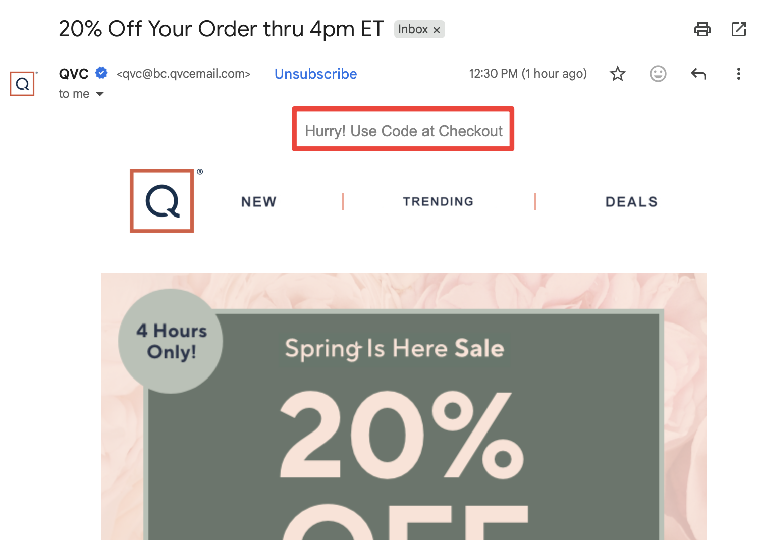
Touch Target Issues Aren’t Just for Mobile
The size of touch targets (links, buttons, or icons) is not just an accessibility issue in mobile apps and websites. It’s a real consideration for your email copy, too.
Small, tightly packed links create barriers for users with limited dexterity and can increase accidental clicks, taps, or touches for everyone else.
To address this, design with:
- Bigger targets.
- Increased spacing.
- Clear intent.
This is one of those rare moments where accessibility and email conversion optimization say the same thing.
Accessibility Includes the Exit
Accessibility doesn’t end at engagement; it includes the exit. An accessible email respects the user’s ability to leave as easily as they arrived.
And yet, unsubscribe links or buttons are often:
- Buried in the fine print.
- Confusing (or sometimes impossible) to locate and / or read.
- Or the process is intentionally difficult to follow.
That’s not just bad user experience and accessibility. That’s an exclusionary design.
From Checklist to Intentionality
The small details that often get overlooked are actually the ones that can most impact the readers’ experience. When we get those right, our emails aren’t just more accessible, but they’re easier to read, simpler to navigate, and more compelling. Which, coincidentally, is exactly what good marketing is supposed to do.
Resources
- Email Accessibility Best Practices
- Microcontent: A Few Small Words Have a Mega Impact on Business (Email Subject Lines)
- Accessible Writing: Simple Steps to Inclusive Communication
- Give it to Me Straight! - The Power of Plain Language
- Keep It Simple: Plain Language, Readability and Inclusion
A human author creates the DubBlog posts. The AI tools Gemini and ChatGPT are sometimes used to brainstorm subject ideas, generate blog post outlines, and rephrase specific sections of content. Our marketing team carefully reviews all final drafts for accuracy and authenticity. The opinions and perspectives expressed remain the sole responsibility of the human author.
