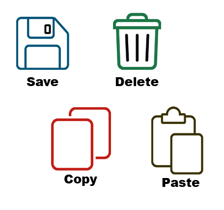
From navigation menus to action buttons, icons can make interfaces feel clean, modern, and compact. But while icons may look sleek and elegant, they don't always clearly communicate meaning, especially when accessibility is a priority.
In this blog, we’ll take a look at the strengths and weaknesses of icons and text labels, explain how each affects accessibility, and outline some best practices for designing interfaces that work for everyone.
What Is an Icon?
An icon is a small graphical symbol that represents an object, action, or concept. Icons help users recognize common functions without reading text.
Examples include:
- 🏠 Home
- 🔍 Search
- 🗑️ Delete
- ✏️ Edit
- 📅 Calendar
Icons can help reduce visual complexity, but only if users immediately understand what they mean.
Pros of Icons
- Save screen space.
- Create a visually clean interface.
- Can be recognized quickly when they're familiar.
- Help users scan groups of related actions.
- Work well alongside text to reinforce meaning.
Cons of Icons
- Most icons are not universally understood.
- Many symbols have multiple possible meanings depending on context, the users’ culture and background, and lived experiences.
- Users with low vision may struggle to distinguish small visual details.
- Screen reader users require a visible text label or an accessible name by using aria-label, regardless.
An icon that seems obvious to some may be unfamiliar or interpreted differently by others.
What Is a Text Label?
A text label is a written word or phrase that explicitly identifies an action, destination, or object.
Examples include:
- Home
- Search
- Settings
- Export Report
- Download Invoice
Unlike icons, text communicates meaning directly rather than relying on recognition or interpretation.
For more detailed information on text labels, please see Label it Accessible and Accessible Microcopy: Small but Mighty.
Pros of Text Labels
- For many actions, users can identify text labels more quickly than icons.
- Text labels can reduce cognitive effort by eliminating the need for users to mentally translate an image into an action.
- They are easier for new users to understand.
- Translate more consistently across cultures.
- Benefits many users, including those with cognitive disabilities, learning disabilities, low vision, and users relying on browser zoom or text resizing.
- Provide accessible names for assistive technologies.
Cons of Text Labels
- Text labels need careful wording. Labels like Submit, Process, or Execute can be ambiguous.
- For multilingual support websites, every language changes the label length, which can affect layouts and maintenance.
- Can increase visual clutter if the labels are verbose, making the interface feel busier.
It’s true, text can often take up more page real estate, but the payoff is that it reduces cognitive effort by making icons and their function easier to identify and understand, resulting in faster task completion, fewer errors, and improved usability for both sighted users and people navigating with screen readers.
The Best Solution? Icons + Text Labels
In many situations, such as primary and side navigation, dashboards, toolbars, and action buttons, the strongest design combines both icons and text.
Together they create faster recognition, fewer errors, and better accessibility. The icon provides quick visual recognition while the text label removes uncertainty. The icon becomes visual reinforcement rather than the sole source of meaning.
A Few Best Practices for Designing with Icons & Text Labels
Don't Depend on Tooltips
One common mistake is hiding labels inside tooltips. While tooltips offer additional guidance, they should not be used for defining an icon.
Tooltips can create usability challenges because they require users to hover with a mouse or move keyboard focus to reveal content. That adds an extra step to completing a task. Repeatedly opening tooltips to understand what each icon means will slow users down and increase cognitive effort.
Design for Recognition and Understanding
- Use visible text labels with icons whenever space allows.
- Use widely recognized icons whenever possible.
- Keep icon placement consistent throughout the interface.
- Clearly associate the text label and icon by placing them in close proximity without overlapping.
- Ensure icons use proper target size and color contrast.
- Use aria-label when the icon must stand alone due to legitimate space constraints.
- If a visible text label is present, do not add an aria-label that can duplicate or override it. In most cases, the visible label should automatically provide the icon’s accessible name.
Simplicity and Clarity
Icons support recognition, reinforce meaning, and improve visual organization. Text labels complement them by providing precision and reducing cognitive effort.
The most accessible interfaces are not necessarily the ones with the fewest words. They are the ones that communicate their purpose and share content most effectively. If you are unsure whether an icon can stand on its own, adding a text label is the simplest and most effective way to improve both accessibility and usability.
Resources
- Icon Usability
- Do icons need text labels?
- In Defense of Text Labels
- Avoid Too Much Content
- Use Icons that Help the User
- Use Clear and Understandable Content
A human author creates the DubBlog posts. The AI tools Gemini and ChatGPT are sometimes used to brainstorm subject ideas, generate blog post outlines, and rephrase certain portions of the content. Our marketing team carefully reviews all final drafts for accuracy and authenticity. The opinions and perspectives expressed remain the sole responsibility of the human author.
