
While working to correct some minor policy issues reported in the DubBot app, two pages were flagged for Image alt text is less than 12 characters.
When I opened the Detailed Page View, I saw that the images were small, like icons, and gray in color. Since they were part of instructional text, I double-checked the contrast using WebAIM’s contrast checker.
Here’s what the results told me. The contrast failed WCAG AA & AAA for Normal Text, and WCAG AAA for Large Text. But passed the third contrast check, which applies to Graphical Objects and User Interface Components.
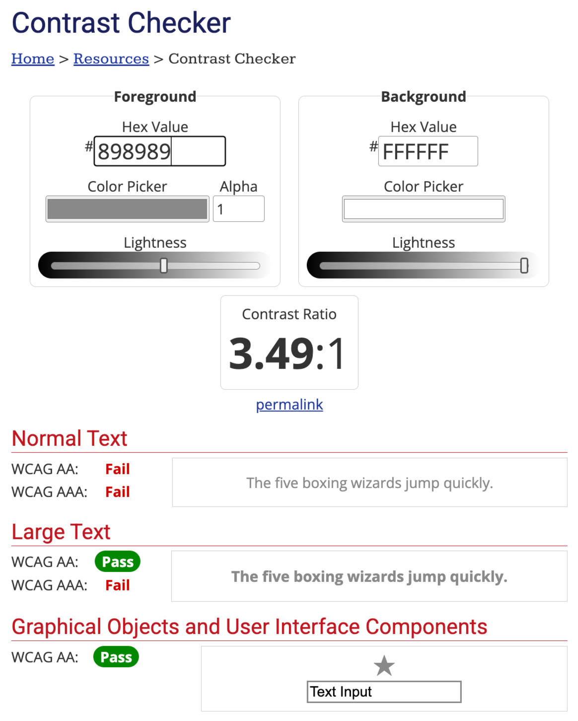
That was like an Ah-ha moment for me. I think we tend to pay attention to color contrast for text and focus indicators, and forget that other visual elements matter too. UI components like buttons and graphical objects like meaningful icons also need sufficient contrast to provide clear visual cues.
So I decided to dig into what that third result for WebAIM actually means, and why it has its own line in the contrast checker.
WCAG 1.4.11 Non-text Contrast
Success Criterion 1.4.11 Non-text Contrast is a Level AA requirement. It says that certain visual information must have a contrast ratio of at least 3:1 against adjacent colors. That applies to two categories.
The first is User Interface Components - the visual cues people need to recognize a control and identify what state it's in. For example, the filled portion of a progress bar, or a checked checkbox.
The second is Graphical Objects. These are the parts of an image or graphic someone needs in order to understand the content. Meaningful icons, along with lines and bars in a chart or arrows in a diagram, are included in this category.
Think of these two categories like this. User Interface Components help people interact with a page. They tell the user:
- This is a button.
- This checkbox is checked.
- This toggle is on.
Graphical Objects convey content through graphics. They help people understand the page information.
For example, a weather dashboard. The button to switch between hourly and daily forecasts is a user interface component. Its border, background, or other visual characteristics need sufficient contrast so users can identify and operate it.
The temperature graph, where the lines communicate temperature changes, is a graphical object. The lines or other visual elements needed to understand the data need sufficient contrast.
For comparison, regular text under SC 1.4.3, Contrast (Minimum) (Level AA) needs 4.5:1, and large text needs 3:1. That's why my gray icons failed the Normal Text check but still pass the Graphical Objects check. Their contrast landed somewhere between 3:1 and 4.5:1, which is enough for an icon but not enough for body text.
Please note this important caveat from WebAIM related to 1.4.11 Non-text Contrast:
There is one notable difference in how contrast requirements are applied. Contrast requirements in WCAG 2.0 are between text and background, but 1.4.11 requires contrast of at least 3:1 against adjacent color(s), which means you may need to measure contrast in more than one place. A non-text element may have different contrast on one side than the other (like a wedge in a pie chart), or it may contain different-colored components that need 3:1 contrast with each other. ~ Contrast and Color Accessibility
Exceptions to SC 1.4.11 Non-text Contrast
A few exceptions are worth knowing so you don't chase issues that aren't really issues.
Inactive or disabled components are exempt. A grayed-out Submit button that isn’t currently usable doesn’t have to meet 3:1 contrast, though it’s still good practice to make it clear that the button exists and why it’s disabled.
Components whose appearance is set entirely by the browser, and not changed by the author, are also exempt. If you've left a default checkbox alone, the browser's styling is the browser's responsibility.
Graphics where a specific presentation is essential, meaning if those graphics were removed, it would fundamentally change the information or functionality of the content, do not have to meet the contrast ratio. For example, a logo or brand mark, or a map showing geographic boundaries.
And decorative images, the ones that don't convey any information, are outside the scope entirely.
Why Does This Matter?
Low-contrast icons and controls are hard to see for people with low vision, people with color vision deficiencies, and really, anyone using a phone outside on a sunny day or looking at an older, dimmer monitor. If someone can't see the outline of a form field, they may not realize the field has been selected, and that is where they need to enter the information. If they can't see the icon in an instruction like Select the gear icon to open settings, the instruction stops making sense.
That second example is exactly the situation I ran into. The icons were part of the instructions. If a user couldn't see them clearly, they couldn't follow the steps.
Back to Those Flagged Images
So what about the original ALT text flag? Checking contrast was a detour, but a useful one, because it confirmed the icons were meaningful and visible enough to meet WCAG 1.4.11. That meant they also needed ALT text that did their job in context.
Short ALT text isn't automatically wrong. An icon with ALT text like Settings can be perfectly appropriate. DubBot's Custom Policy check is a prompt to take a second look, not a verdict. In my case, reviewing the images in context helped me confirm whether the ALT text described what each icon represented within the instructions, and adjust where it didn't.
Remember: color contrast isn't just a text issue. Any time an icon, border, chart element, or control state carries meaning, it needs a contrast ratio of at least 3:1 against the surrounding colors. So next time you run a contrast check, don't stop at text alone.
Resources
- Web Accessibility Evaluation Guide
- Understanding SC 1.4.11 Non-text Contrast (Level AA)
- Contrast and Color Accessibility - Understanding WCAG 2 Contrast and Color Requirements
A human author creates the DubBlog posts. The AI tools Gemini and ChatGPT are sometimes used to brainstorm subject ideas, generate blog post outlines, and rephrase certain portions of the content. Our marketing team carefully reviews all final drafts for accuracy and authenticity. The opinions and perspectives expressed remain the sole responsibility of the human author.
