This is a follow-up post to the four-part ALT text series that began with ALT Text Isn’t a Description. It’s a Content Decision.
An effective web accessibility strategy doesn’t happen overnight. It’s a long-term framework that weaves accessibility into everything from leadership and company culture to ideation and design, coding and content creation, and purchasing and maintenance. ~ Building a Sustainable Web Accessibility Strategy
To ensure good, intentional ALT text is part of your accessibility strategy, you must move into a deliberate, principled approach, reframing ALT text as content.
This style guide can help you and your team reposition ALT text as an editorial decision and a brand asset so every image is purposeful - adding value, context, support, and even authenticity to the other content elements on the page.
Function Over Form
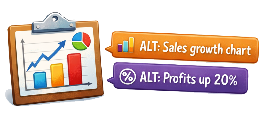
Determine the image’s purpose before creating the ALT text.
Category |
Definition |
Alt Text Strategy |
Informative |
photos, illustrations, charts, or diagrams designed to convey specific, meaningful information |
summarize essential data, context, and insight in clear, purposeful language so nothing meaningful is lost |
Functional |
initiates an action, it's neither decorative nor informative |
communicate the action clearly and concisely using purposeful, verb-driven language |
Decorative |
is used for visual styling, to enhance the page's visual appeal, and provides no essential or supporting information |
use a null ALT attribute (alt=""), preventing screen readers from announcing the image file name |
Punctuation Matters
Use normal sentence casing. Avoid all caps (which screen readers may read letter by letter) and excessive emojis. Use all nominal punctuation, and end all sentences with a period. This tells the screen reader to pause, making the user experience feel more conversational.
Put the Important Details First
Lead with the most essential details so screen reader users can quickly decide whether to keep listening or move on.
When in Doubt, Ask the Author
If you’re unsure what the ALT text should say or how it should sound, talk to the author of the surrounding content. Understanding why they chose the image and what content it’s intended to support ensures the ALT text aligns with the page’s purpose.
ALT text and Your Brand’s Voice & Tone
A brand's voice is consistent, and its tone adapts to the context. Your ALT text should reflect both for your brand.
These nuances will help you bring your brand into your ALT text appropriately, without compromising accessibility:
Clarity comes first. Accessibility is always the primary goal.
ALT text exists to communicate meaning to people who can’t see the image. Before you think about tone or voice, make sure the image's purpose is accurately conveyed. Brand expression should never compete with the understanding of the message.
Confident brands understand context. ALT text serves the user experience, not a headline strategy.
ALT text is not the place for clever taglines, emotional hooks, or persuasive language. ALT text should feel natural and informative, not promotional.
Consistency matters.
If your brand voice is clear, confident, and purpose-driven, your ALT text shouldn't suddenly shift into vague, ambiguous, and scattered. Align your brand’s voice and tone with your broader editorial standards to create a cohesive experience across every touchpoint.
ALT Text Review
Every piece of content should pass this ALT Text Audit before publishing. ALT text explains why the image exists, not just what it looks like. Writing good ALT text requires editorial judgment and context awareness, not just visual accuracy.
Purpose First
- Does the ALT text reflect why the image is on the page?
- If the image disappeared, would the ALT text still communicate its purpose and meaning?
- Is it aligned with the page’s main topic?
Specific, Not Vague
- Does it avoid phrases like image of, photo of, or graphic showing?
- Is it more than a surface-level, literal description of what an image looks like?
- Does it include relevant details that convey the purpose and meaning of the image?
Context Aware
- Does it connect to nearby headings, captions, or body copy?
- Does it avoid repeating any nearby surrounding text?
- If the image includes text, is that text captured in the ALT text, if it’s important?
Functional & Informative Accuracy
- If the image is a link or button, does the ALT describe the action?
- If it’s a chart or infographic, does the ALT summarize the key takeaway information?
- If it conveys data, are the most important numbers or conclusions included?
Decorative
- Is the image truly decorative?
- If yes, is the ALT attribute intentionally empty (alt=" ")?
Biases & Assumptions
- Unless they’re relevant, have you avoided including assumptions about race, gender, age, or other attributes?
- Are you focusing on what the image actually shows and means, or have you included your own assumptions, interpretations, or emotions that aren’t actually in the image?
Length & Clarity
- Is it concise while still complete?
- Would it make sense if read aloud on its own?
- Does it avoid keyword stuffing?
- Is it "Searchable" but not "Spammy"?
Pro Tip:
There is no hard-and-fast rule on how many characters should make up your ALT text. The WCAG criterion SC 1.1.1: Non-text Content (Level A) provides no guidance or rules. If an image, such as a graph, requires extended text, consider providing a summary in the ALT text and a long description in the surrounding content.
Consistency
- Does the ALT text reflect the brand voice and tone where appropriate?
- Are you treating ALT as a content decision and not a technical afterthought?
The Decision in Action
Three different contexts using the same image. The image is a group of people in a boardroom looking at a blank whiteboard.
- Context A
The image is on the hiring page. The ALT text would read something like this: The collaborative engineering team during a weekly brainstorming session. - Context B
The image is on the software tutorial page. The ALT text would read something like this: A blank whiteboard used to map out user flow architecture. - Context C
The image is in an internal memo. The ALT text would read something like this: Employees gathered in the main conference room for the Q3 town hall.
By treating ALT text as a thoughtful, intentional part of your accessibility strategy, you turn something often overlooked into a meaningful experience for every user. You will craft ALT text that not only meets accessibility standards but also strengthens your brand.
A human author creates the DubBlog posts. The AI tools Gemini and ChatGPT are sometimes used to brainstorm topic ideas, generate blog post outlines, and rephrase portions of content. Our marketing team carefully reviews all final drafts for accuracy and authenticity. The opinions and perspectives expressed remain the sole responsibility of the human author.
