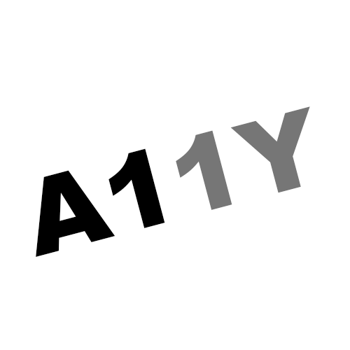
Sometimes it's a good thing I’m not in an office during work hours. Here’s a perfect example of why. When I saw the headline of one of my regular email subscriptions, I screamed out loud, Damn skippy! I’ve been asking that question for years!
What was the headline that elicited such an enthusiastic response? The headline read: Why don't we use black text anymore? It was pinned by Diana Khalipina (LinkedIn) in the Sept.6 issue of her daily publication titled A11y explained with Diana (Substack)
After reading her post, I was even more convinced. Gray text has its place, but it's time to bring black text back.
As web design moved toward minimalist layouts in the 2010s, designers increasingly used shades of gray instead of black for body copy, labels, metadata, and supporting content. The idea was simple. Black text looked too heavy, while gray created a softer, cleaner visual hierarchy and made body copy feel less visually dominant.
The problem is that subtle for some can mean harder to read for others.
The concern isn't that gray is inherently inaccessible. It's how much contrast it has against its background. Gray text on a white background can look elegant on a large monitor in a controlled environment. Still, it can become surprisingly difficult to read for someone with low vision or reduced contrast sensitivity.
And the difficulties are not limited to people who identify as having a visual disability.
Try reading light-gray text on your phone outdoors. Add sunlight, screen glare, a smaller display, or a slightly older pair of eyes. Suddenly, that carefully chosen subtle gray isn't so elegant. It’s simply difficult to see.
Black or near-black text generally provides the strongest contrast on white backgrounds, making body copy easier to read, especially for people with low vision or in bright, glare-heavy conditions. Gray text can work for secondary content, but lighter shades may be harder to perceive and can fall below WCAG contrast requirements.
WCAG 2.2 Level AA requires a 4.5:1 contrast ratio for normal-sized text and 3:1 for large text.
And according to WebAIM,
You cannot round a contrast ratio up to 4.5:1. For example, #777777, a commonly-used shade of gray with a 4.47:1 contrast ratio, does not meet this requirement. ~ Contrast and Color Accessibility
This is #777777 gray text on a white background.
When in doubt, choose darker text to maximize readability and move closer to meeting accessibility requirements.
Black or near-black text doesn't have to mean abandoning visual hierarchy. Use font size, weight, spacing, layout, and white space to make visual design more accessible to people with disabilities. Gray still has its place. But if we're choosing between subtle and readable, perhaps readable should win more often. Good design shouldn't ask users to work harder to read the content.
It isn't about making every website look like a newspaper. It's about giving the words enough visual weight to hold up in real-world conditions. A very dark gray can provide plenty of contrast while feeling slightly softer than pure black. The key is to check the contrast and test it under different lighting conditions rather than simply eyeballing whether a color is accessible.
Accessibility isn't just about whether something technically passes a test. It's about whether people can comfortably use it in the real world.
If black text gives your readers a better experience, why wouldn't you use it?
Resources
- Understanding WCAG 1.4.3: Contrast (Minimum)
- WebAIM: Contrast and Color Accessibility
- WebAIM Contrast Checker
- Low-Contrast Text Is Not the Answer
- Apple Human Interface Guidelines
- Specifying text and background colors of secondary content such as banners, features and navigation in CSS while not specifying text and background colors of the main content (W3C Technique)
A human author creates the DubBlog posts. The AI tools Gemini and ChatGPT are sometimes used to brainstorm subject ideas, generate blog post outlines, and rephrase specific sections of content. Our marketing team carefully reviews all final drafts for accuracy and authenticity. The opinions and perspectives expressed remain the sole responsibility of the human author.
