
One of the easiest accessibility mistakes to make, and one that I think is often overlooked, is relying on color to communicate something important. It might be a red outline around a form field, a blue link in a paragraph, or a chart that uses different colors to distinguish data. These choices may look perfectly clear to you, but not everyone sees color the same way.
The good news? Fixing these issues is pretty straightforward.
WCAG Success Criterion 1.4.1: Use of Color requires that color not be the only visual way to convey information, indicate an action, elicit a response, or distinguish an element. In other words, color can add meaning, but it shouldn't do all the work.
Who Does Use of Color Affect?
People with color vision deficiencies may have difficulty distinguishing certain colors, particularly red and green. People with low vision can also struggle with color distinctions and may lose those distinctions when viewing content in gray scale or using display filters.
Note: This is not just about accommodating a particular group. When a form doesn't explain an error or a chart doesn't clearly identify its data, the result can be a confusing experience for everyone.
What Does a Color-Only Accessibility Issue Look Like?
Start by looking at elements on your website where users must recognize a color difference to understand what's happening.
Then ask yourself this: If someone couldn't distinguish these colors, would they still understand the information or action to take?
If your answer is no, you may have a color-only accessibility issue.
Here are four common elements where this issue may occur.
Links
Links appear in blue within a paragraph, but there's no underline or other visual indicator to distinguish them from surrounding text.

Form Errors
A field turns red when someone makes a mistake, but there's no error message explaining what went wrong.

Required Fields
Required fields have red labels, but no asterisk or Required text to identify them.

Charts and Graphs
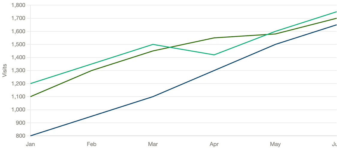
Data series use different colors (sometimes very similar colors, which causes issues too) but have no labels, patterns, or other ways to distinguish one data set from another.
How Do You Fix Color-Only Issues?
The solution is very simple. Choose and use accessible color palettes, ensure proper contrast, then add another visual indicator that communicates the same information.
For example:
Links
Add an underline so links stand out from adjacent text, even when their color isn't distinguishable.

Form Errors
Provide an accessible error message with instructions on how to fix the error. Place the message in close proximity to the form field, such as above the field or to the right of the field.

Required Fields
Add an asterisk or a visible Required label (or both). Explain the asterisk convention at the top of the form, ahead of any form fields.

Charts and Graphs
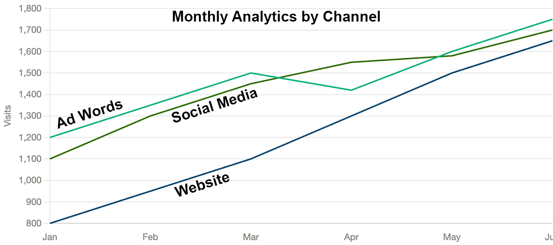
Use direct labels, distinct line styles, shapes, or patterns so people can identify data series without relying on color alone.
Status Indicators
Use icons or text alongside color indicators. For example, pair green for Success with a checkmark and red for Failed with an X.

One Important Distinction
Color contrast and use of color are two different accessibility requirements, but they work closely together.
Sufficient contrast helps people distinguish foreground elements from their backgrounds. Use of color addresses whether color is the only visual cue conveying information.
A design can meet contrast requirements and still have a use-of-color issue.
Make Testing for Use of Color Part of Your Accessibility Strategy
When reviewing a website, check links, forms, charts, status indicators, and interactive elements. Determine if each element can communicate its purpose without depending on color alone.
Color should support and / or reinforce meaning, but not be the only way to communicate it.
Adding a second visual cue is a simple change that makes a big difference in how people understand and use your website.
Small, intentional improvements can remove real barriers for users while helping you build accessibility into your everyday workflows.
Resources
- Use of Color
- Understanding SC 1.4.1 Use of Color (Level A)
- Color Only LinkedIn post from IxDF - Interaction Design Foundation
A human author creates the DubBlog posts. The AI tools Gemini and ChatGPT are sometimes used to brainstorm subject ideas, generate blog post outlines, and rephrase certain portions of the content. Our marketing team carefully reviews all final drafts for accuracy and authenticity. The opinions and perspectives expressed remain the sole responsibility of the human author.
