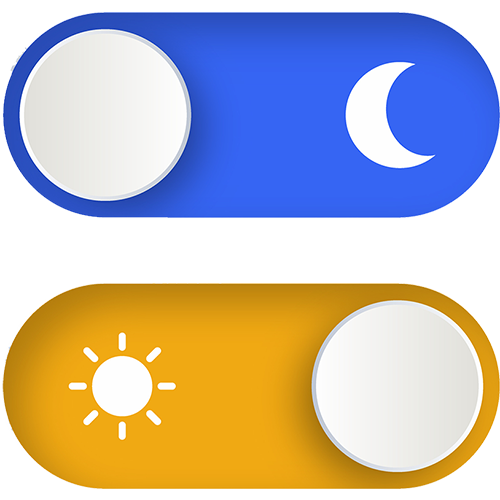
Dark mode is no longer a niche developer preference. With the 2019-2020 releases of iOS 13, Android 10, and Windows / macOS system-level toggles into the mainstream, dark mode has since become a widely offered option.
Last week, the Support Team received an unusual support issue related to dark mode. That conversation later led to a discussion with the whole team comparing dark vs. light mode preferences and why.
As the conversation unfolded on Slack, it was clear that, based on who responded, most DubBot team members are fans of dark mode and use it regularly.
Their reasons were mostly physical, such as tired eyes, light sensitivity, and screen fatigue by the end of the day. Some teammates run dark mode permanently and layer on extra tools like blue-light glasses, auto-dimming lenses, and even e-ink readers. Others fine-tune the iOS Reduce White Point setting and make it a shortcut. A few, including me, actually prefer bright screens and find dark interfaces harder to read.
That mix is probably a fair representation of users in general and a pretty good reminder that accessibility isn't always about finding one setting that's best for everyone.
A design that feels comfortable to one person can be difficult or unpleasant for another.
User Preference Matters
Dark Mode Isn't Automatically More Accessible
It's easy to think of dark mode as strictly an accessibility feature. And for some users, it absolutely can improve the experience.
But dark mode itself doesn't guarantee an accessible interface. Accessibility fundamentals must be baked in. Sufficient contrast is essential throughout the interface, not just for text and backgrounds. Keyboard users need visible focus indicators regardless of theme, and non-text elements like buttons, form controls, and graphics need adequate contrast as well. Interactive states like hover, focus, active, selected, and disabled should stay distinguishable, and components should remain equally identifiable and usable across theme changes. Images and graphics also deserve attention, since one that works well on a light background won't necessarily work on a dark one.
And then there’s this: a page can pass accessibility checks in one mode and fail them in another. This was actually the issue that sparked our conversation.
Light Mode and Dark Mode Can Create Different Accessibility Issues
Imagine a website where dark mode passes automated contrast testing, but light mode uncovers several contrast failures.
A text color that has enough contrast in dark mode may not have enough contrast in light mode. A border color that works with one background may disappear against another. A focus indicator that is highly visible in dark mode may become nearly invisible in light mode.
And then there are user preferences, variables like ones mentioned in our conversation. Folks mentioned using things like Reduce White Point, blue-light-filtering glasses, automatic dark mode, and even specialized displays designed to reduce screen glare and brightness.
These are not necessarily accessibility tools, but they are examples of how people customize their digital environments to make screens more comfortable and easier to use.
When designing dark and light modes, the goal should be to make sure both experiences are accessible, usable, and visually effective.
To help make that happen, keep a few things in mind:
- Give users a choice when appropriate -
If your interface supports both light and dark modes, let users choose the experience that works best for them. - Respect system settings -
Many users have already chosen a preferred theme at the operating-system level. Your website should respect that preference rather than making users override it. - Test every supported version -
Run accessibility checks on both light and dark themes. Passing one version doesn't guarantee the other will pass. - Look beyond contrast -
Color contrast matters, but it’s only one aspect of accessibility. Check focus indicators, component states, icons, borders, images, and other visual cues in both themes.
The Real Preference Isn't Light vs. Dark
The team conversation started out by just learning which mode folks prefer. It ended up an excellent illustration of why accessibility is rarely that simple.
Some people want dark mode all the time. Some want it only at night. Some prefer light mode. Some people adjust their devices in other ways to make screens easier to use.
No single setting solves everyone's needs. And that's okay.
The goal of accessible design isn't to pick the universally correct color scheme. It's to create experiences that respect the fact that different people need different things.
Accessibility rarely comes down to one setting that works for everyone. And sometimes, the best accessibility feature is simply having a choice.
Resources
- 12 Principles & Best Practices of Dark Mode Design
- StatCounter — Android Version Market Share Worldwide (July 2026 snapshot)
- StatCounter — iOS Version Market Share Worldwide (July 2026 snapshot)
- A Brief History of Dark Mode - From the Matrix-like Displays of the Early ’80s to Today
A human author creates the DubBlog posts. The AI tools Gemini and ChatGPT are sometimes used to brainstorm subject ideas, generate blog post outlines, and rephrase specific sections of content. Our marketing team carefully reviews all final drafts for accuracy and authenticity. The opinions and perspectives expressed remain the sole responsibility of the human author.
