If you’ve ever flipped through a book, you’ve used pagination. On websites and in digital documents, pagination (sometimes referred to as breadcrumbs) works the same way. It breaks content into manageable pages rather than presenting it as a single, endless scroll. It also provides a clear structure for moving back and forth while loading smaller chunks of content, which reduces lag.
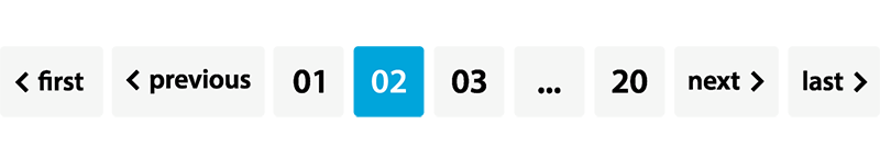
Some examples of pagination are:
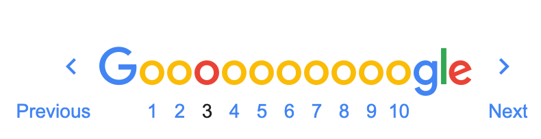
Search Engine Results Page (SERP)
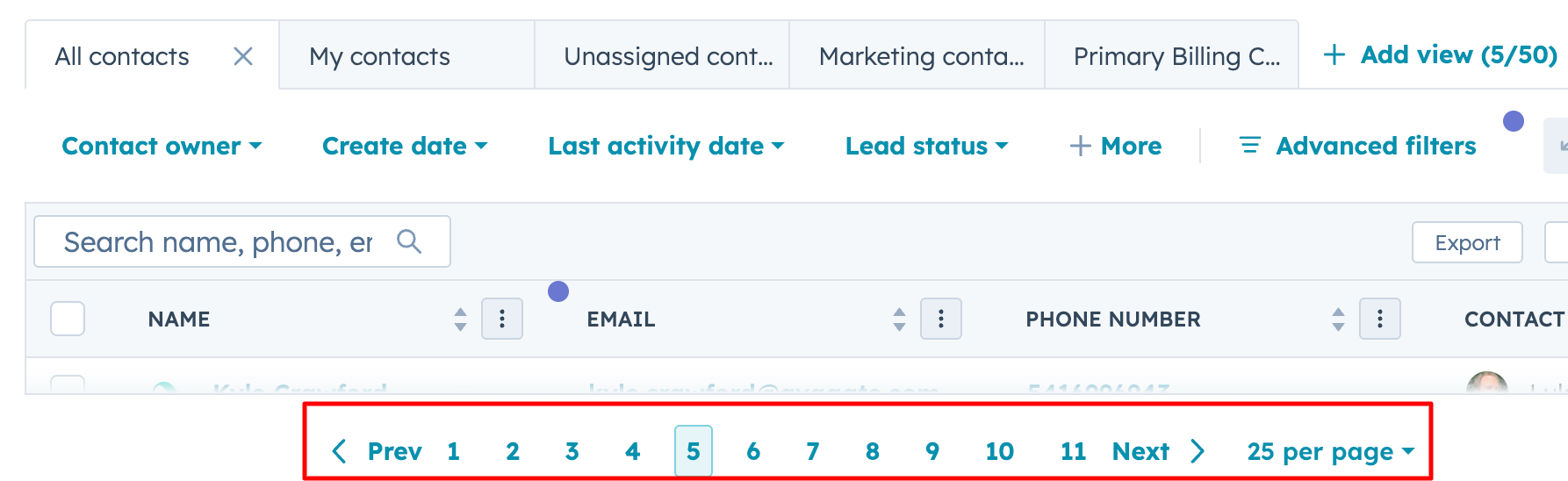
Customer Relations Management system (CRM)
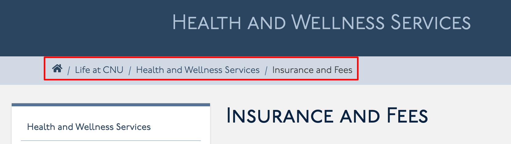
University Website
Done right, pagination helps users quickly find where they are, where they’ve been, and where they can go next. Done incorrectly, it can become a confusing maze of numbers, ambiguous navigation, and accessibility failures.
Let’s examine some best practices for usability and accessibility to help ensure your pagination functions as intended.
Accessibility Challenges of Pagination
Pagination can become frustrating and unusable when:
- Page numbers are too small to select.
- Links lack proper labels ( 1, 2, 3 … don’t mean much out of context).
- The Current page isn’t announced clearly for screen readers.
- The Next and Previous links are missing or unclear.
Best Practices for Accessible Pagination
It’s not enough to just visually style a series of links. The markup must be meaningful and informative to all users. This means using proper HTML elements and supporting attributes that convey relationships and states programmatically. Getting this right ensures that everyone – regardless of how they navigate – can move through your site with confidence and clarity. ~ A Quick Primer on Accessible Pagination, Karl Groves
Use Clear Labels
Use aria-label or descriptive text ( Page 1 > Page 2) so screen reader users are informed of the link's destination.
<nav aria-label="Pagination">
<ul class="pagination">
<li><a href="?page=1" aria-label="Page 1">1</a></li>
<li><a href="?page=2" aria-label="Page 2">2</a></li>
<li><a href="?page=3" aria-label="Page 3">3</a></li>
<li><a href="?page=2" aria-label="Next page">Next »</a></li>
</ul>
</nav>
Indicate the Current Page
Ensure the current page is visually distinct and programmatically identifiable. The aria-current="page" attribute tells assistive technology, You are here.
<li>
<a href="?page=3" aria-current="page">3</a>
</li>
Ensure Keyboard Usability
- Every pagination link should be accessible via the Tab key.
- Focus indicators must be visible, have proper contrast, and follow the logical order of the pagination.
Provide Previous and Next Links
Not everyone wants to hunt through page numbers. Always include clear Previous and Next links, with meaningful labels. For example:
Previous < Page 1 | Page 2 | Page 3 > Next
Think Beyond Numbers
Some users prefer to jump to the beginning or end. Consider adding First and Last page links.
On mobile, tiny tap targets can be frustrating and even unusable. Ensure your target size meets WCAG SC 2.5.8: Target Size (Minimum) (Level AA), which specifies a target size of 24 x 24 to be compliant.
Pagination Using Page Names
In the example above, labeled University website , the pagination uses the page names:
Life at CNU / Health and Wellness Services / Insurance and Fees
There are pros and cons to using this pagination style.
Pros
Clear and descriptive pagination benefits everyone. When users can see exactly what content is on each page, navigation becomes clear and frustration-free. For screen reader users, meaningful page labels provide context beyond simple numbers, making it easier to understand and navigate the content. Descriptive links also support SEO, helping search engines better understand the relevance of your content.
Cons
When designing accessible pagination, it’s important to strike a balance between user expectations, scalability, and the nature of your content. Users accustomed to numeric pagination may find it confusing when page labels suddenly switch to descriptive names. Then there is scalability. If your site has 20 or more pages, assigning each a unique descriptive name can quickly become unwieldy and cluttered. Additionally, for dynamic content that changes frequently, maintaining accurate, meaningful page names can be challenging, potentially leading to inconsistencies that frustrate users.
To help balance the pros and cons of this pagination style, pair it with a clear structure and accessibility best practices, like these:
- Combine approaches by using numbers for progress and descriptive text for context. For example:
Page 1: Overview | Page 2: Features | Page 3: Pricing
- Use ARIA labels or visually hidden text to announce both the number and the page name to screen readers.
When to Consider an Alternative
Pagination isn't the only option for presenting content in manageable chunks. Sometimes, a Load More link can be more effective. A Load More link allows users to reveal more content without leaving the current page.
Consider this approach if you have a medium / average amount of content. Content that is long enough to require multiple pages, but not so extensive that it overwhelms users, is ideal. A Load More link is especially useful on shopping or product pages, where people often want to keep browsing without losing their place. It's often found on news feeds, galleries, or blogs, where the goal is to keep readers engaged and moving naturally through the content. And remember, this method, too, must be accessible.
Accessible pagination isn't rocket science, but it does require thoughtful markup and design. With clear labels, ARIA support, and touch-friendly spacing, your pagination can work seamlessly for everyone.
Resources
A human author creates the DubBlog posts. The AI tools Gemini and ChatGPT are sometimes used to brainstorm subject ideas, generate blog post outlines, and rephrase certain portions of the content. Our marketing team carefully reviews all final drafts for accuracy and authenticity. The opinions and perspectives expressed remain the sole responsibility of the human author. (Updated Sept. 15, 2025)
