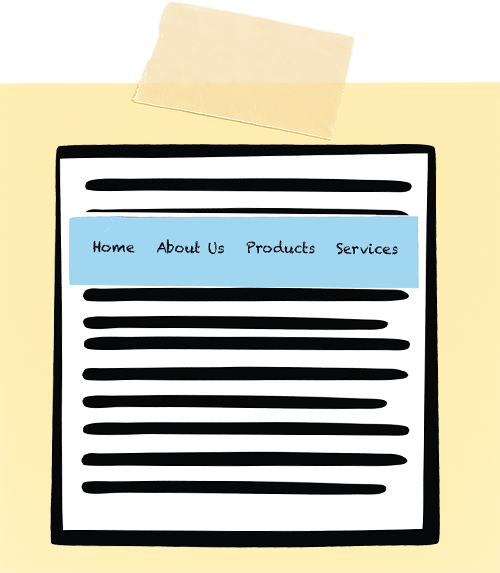
Persistent navigation, or sticky navigation, remains fixed to the top or side of the screen as users scroll. Marketers love it because key links stay visible. Designers love it because it feels sleek and convenient. And while sticky navigation can improve usability, it often introduces a range of accessibility barriers that many teams overlook.
When implemented poorly, sticky navigation can obscure content, disrupt keyboard navigation, confuse screen readers, and increase cognitive load. What’s meant to be helpful can accidentally make a site more complicated to use for people who rely on assistive technologies or alternative input methods.
Sticky navigation isn’t inherently bad, but it must be implemented thoughtfully.
Let’s look at why sticky navigation can undermine web accessibility and how to avoid the most common pitfalls.
Sticky Elements Can Obstruct Content
One of the most common issues is that sticky elements physically cover parts of the screen. On a large desktop monitor, this might seem harmless, but for users on small screens, tablets, or those zooming in to enlarge text, a sticky element can consume a large portion of the viewport.
Why is this a problem?
- People with low vision often zoom to 200% or more; a 100px sticky header can quickly become a 30 – 40% screen obstruction.
- Users may not realize that content is hidden beneath the surface, leading to confusion or missed information.
- On mobile devices, sticky elements compete with the OS-level user interface, further reducing usable space.
Sticky Navigation Can Disrupt Keyboard Flow
Many users navigate websites sequentially, using only a keyboard. The flow can break if the navigation is coded improperly.
Common keyboard problems are:
- The sticky menu is located early in the DOM, so each new page scroll requires tabbing through the whole menu again.
- Some sticky navigation uses JavaScript to re-activate or redraw the menu when the sticky navigation changes state (e.g., shrinking on scroll), causing keyboard focus to jump backward unexpectedly.
- Focus indicators appearing offscreen or under the sticky element.
- Sticky components can overlap focus indicators, making focus position unclear.
Sticky Navigation Can Interfere With Skip Links
Skip-to-main-content links are foundational accessibility features. They let keyboard and screen reader users bypass repeated navigation and jump straight to the main page content.
Sticky navigation can unintentionally disable or break skip links when:
- The sticky element covers the top portion of the main content where the skip link is located.
- The skip link’s target appears under the sticky header, leading the user to believe nothing happened.
Screen Readers May Announce Sticky Navigation Multiple Times
If sticky navigation is duplicated or updated in the DOM, or re-rendered on scroll, screen readers may treat it as a new region and announce it again.
This repetitiveness causes several issues:
- Cognitive overload for users who must repeatedly hear the same elements.
- Repeated announcements can slow down navigation, thus increasing the time and effort required to reach content.
- Navigating long pages becomes a noisy, disorienting process.
Sticky Navigation Can Increase Cognitive Load
For many users, especially those with ADHD, auditory processing disorders, or cognitive disabilities, sticky navigation introduces visual noise. A fixed element that’s always in view or that changes its shape or size can pull attention away from reading or task completion. Even subtle animations (like shrinking on scroll) can feel distracting or disorienting.
Overlapping Interactive Elements Create Pointer Issues
Sticky navigation can overlap interactive content, especially on mobile layouts, making selection difficult.
This affects:
- Users with tremors.
- Users with limited fine motor control.
- Anyone navigating on a small touchscreen.
Making Sticky Navigation Accessible
A sticky navigation isn’t a problem by default. It just needs a smart, accessibility-minded setup to keep things usable for everyone. Here are some ways to do that.
Keep it small and responsive
- Minimize height, especially after zoom or on small screens.
Avoid duplicating the navigation in the DOM
- Do not re-insert or redraw the menu in the DOM.
- Do not reassign focus without user intent.
Ensure skip links land on visible content
- Test that the sticky navigation does not cover the top of the <main> element.
Respect keyboard focus
- Don’t reset focus or introduce new focusable elements on scroll.
Test with real assistive technologies
- Test using screen readers, keyboard-only navigation, and mobile devices.
Test Zoom Levels at 200 – 400%
- Ensure the sticky component does not consume excessive viewport space.
Sticky navigation offers convenience but comes with serious accessibility risks if not handled with care. The solution is not to abandon sticky navigation entirely but to design it accessibly, ensuring that your site remains usable, inclusive, and intuitive for every visitor.
Resources
A human author creates the DubBlog posts. The AI tools Gemini and ChatGPT are sometimes used to brainstorm subject ideas, generate blog post outlines, and rephrase certain portions of the content. Our marketing team carefully reviews all final drafts for accuracy and authenticity. The opinions and perspectives expressed remain the sole responsibility of the human author.
