
Color is a powerful tool. It evokes emotions, adds vibrancy to our surroundings, and significantly influences how we navigate the world.
However, for people with low vision, color vision deficiency, or color blindness, color can also be a significant barrier to perceiving and accessing information and enjoying the full digital and print experience.
The Science of Color: More Than Meets the Eye
Ever wonder why a banana looks yellow and an apple looks red? It all boils down to light and how objects interact with it. We don't actually see objects themselves. Instead, we see the light they reflect into our eyes. When that light hits an object, some colors are absorbed, and others are bounced back or reflected.
The color we perceive depends entirely on the wavelengths of light reflected. A banana looks yellow because it reflects yellow wavelengths while absorbing most of the other colors in the spectrum. When the reflected yellow light reaches our eyes, our brains interpret it as yellow.
What about white and black? These aren't colors in the traditional sense but rather represent how an object handles light. When an object reflects all the wavelengths of visible light equally, we perceive it as white. Conversely, when an object absorbs most of the light that hits it, reflecting very little back, we see it as black.
Understanding this basic principle of light reflection and absorption is crucial, especially when we talk about how it relates to accessibility.
What Influences Our Color Perception?
Age
As we age, our color vision often deteriorates. This is primarily due to the lenses in our eyes yellowing, essentially acting like a yellow filter. This yellow tint makes distinguishing between certain colors, particularly yellows, greens, blues, and purples difficult.
Medications
Many things can affect color vision, but one surprising factor is medication. Both prescription and over-the-counter drugs can alter how we see colors. Some commonly prescribed medications that have been linked to changes in color vision are:
- Digoxin (Lanoxin) - Digoxin, a medication used to treat heart failure and atrial fibrillation, can sometimes cause vision problems, including difficulty distinguishing certain colors due to a yellow-green tint.
- Chloroquine and Hydroxychloroquine - Medications commonly used to treat autoimmune conditions like rheumatoid arthritis and lupus can cause chloroquine/hydroxychloroquine retinopathy. This condition can lead to changes in color vision, including darkening or blurring of vision.
- Viagra (Sildenafil) - This medication, commonly used to treat erectile dysfunction, can cause a temporary blue tint in vision.
Certain Visual Conditions
- Color vision deficiency, sometimes called color blindness, is a visual impairment that affects the ability to perceive certain shades of color. Complete color blindness is a rare condition.
- Low vision is a significant visual impairment that makes it difficult to perform everyday tasks such as reading, driving, recognizing faces, and perceiving specific colors. Lenses, contact lenses, or surgery cannot correct low vision.
- Diseases like cataracts, glaucoma, macular degeneration, optic neuritis, or diabetic retinopathy can damage the eye's color-detecting mechanisms, leading to changes in color perception.
- An injury such as a detached retina can also damage the eye's color-detecting mechanisms.
Each one of these can be considered a temporary, situational, or permanent visual disability that affects color perception. Luckily, the Web Content Accessibility Guidelines (WCAG) provide a framework that instructs best practices for designing and developing digital content so that color is not a key factor in disseminating information.
Guidelines and Best Practices for Digital Color Accessibility
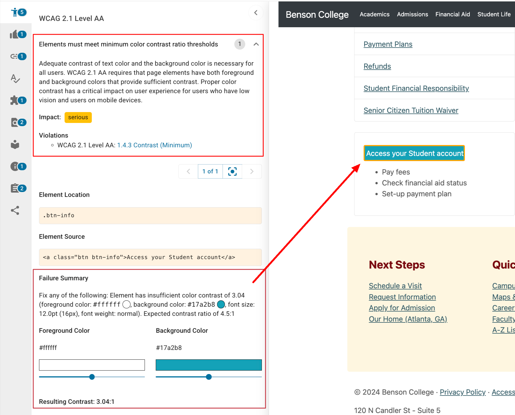
Sufficient Color Contrast (SC 1.4.3: Contrast, Minimum, Level AA)
WCAG mandates sufficient color contrast between the text and its background to ensure it can be "read by people with moderately low vision."
The DubBot app tests for color contrast issues and, within the report, provides interactive background and foreground color sliders to help you calculate the color adjustment to comply with the criteria.
Color Alone Should Not Convey Meaning (SC 1.4.1: Use of Color, Level A) Avoid using color alone to convey information. Relying solely on color to convey meaning increases cognitive load, making it difficult for everyone (not just those with low vision) to quickly and easily understand information. For example, instead of using only red for errors and green for success, supplement the color with other cues like bold text, icons, text labels, shading patterns, audio feedback, or screen reader-compatible labels alongside color-coded elements.
Provide Alternatives for Color-Dependent Visualizations
Offer alternative formats and designs for charts, graphs, and other visualizations that rely heavily on color. Use clear, succinct text labels with varying shading patterns for columns, pie slices, bars, and lines.
Choose Colors Wisely: Use color palettes that are accessible to a wide range of users, including those with color vision deficiencies. For increased visibility, readability, and accessibility, try the 60-30-10 rule when creating color palettes. This rule creates a simplified visual hierarchy that helps users know what to look at first, second, and last and provides a straightforward navigation.
60% dominant element
30% secondary element
10% accent element
Best Practices for Print Color Accessibility
We spend so much time in front of our screens, be it a cell phone, tablet, or desktop, consuming digital news and information that it's easy to forget about print accessibility. While digital accessibility is critical, print materials like magazines, newspapers, brochures, and even restaurant menus still play an essential role in communication and must be equally accessible to everyone.
So, when you’re designing the admissions viewbook or that flyer for the company picnic, keep these color tips in mind. These and web best practices have much in common.
High Contrast
Use high-contrast color combinations for text and backgrounds, ensuring a 7:1 ratio. This ratio is also recommended in SC 1.4.6: Contrast (Enhanced) (Level AAA).
Proper Paper
Use a non-glossy matte paper to eliminate glare. Choose white or off-white to help provide a proper contrast ratio.
Color Only
Avoid relying solely on color to convey information - follow the guidelines provided in SC 1.4.1: Use of Color, Level A. The same goes for graphs and charts.
By understanding the science of color perception and adhering to accessibility guidelines, we can create digital and print experiences that are inclusive of all users, regardless of their visual abilities, leading to more straightforward communication, broader reach, and a more equitable experience for everyone.
Resources
- Color Me Accessible - Seeing Red
- Principles of Print Accessible Design
- How Our Perception of Color Changes as We Age
- 8 Factors That Influence the Way You See Colors
- Brightening up accessibility with a new colour system
- Simplify Your Design Process with the 60–30–10 Rule
- Creating accessible digital colour palettes using the 60-30-10 design rule
- Contrast and Color Accessibility - Understanding WCAG 2 Contrast and Color Requirements
A human author creates the DubBlog posts. The AI tool Gemini is sometimes used to brainstorm subject ideas, generate blog post outlines, and rephrase certain portions of the content. Our marketing team carefully reviews all final drafts for accuracy and authenticity. The opinions and perspectives expressed remain the sole responsibility of the human author.
