
For most colleges and universities, commencement is over, signifying the end of another academic year. Summer term has arrived! For many faculty, this is a time of rest, reflection, and regrouping. That regrouping may include a new or updated syllabus for the impending fall semester.
If that is on your to-do list over summer break, here are a few suggestions for creating an accessible syllabus that ensures all your students, including those with disabilities and users of assistive technologies, can easily read, interact with, and understand the course expectations and materials.
A syllabus is more than a list of readings and deadlines—for many, it's the first point of contact between an instructor and students, and it sets the tone for the class. Making your syllabus accessible can be integral to fostering a welcoming and equitable learning environment.
Creating an Accessible Syllabus
Use Clear, Simple Language
Simplify your language when explaining course policies, objectives, and assignments. Spell out acronyms, define terms, and explain jargon.
Document Structure and Format
- Ensure proper contrast between the document background and text. Limit the use of highlighting and make sure all links are underlined and are the same color.
- Make links descriptive, succinct, and unique. Do not use the URL as link text. For example:
- Use headings in proper order to break up paragraphs. For example
- Heading 1
- Heading 2
- Heading 3
- Heading 4
- Heading 5
- Heading 4
- Heading 4
- Heading 3
- Heading 3
- Heading 2
- Heading 2
- Heading 1
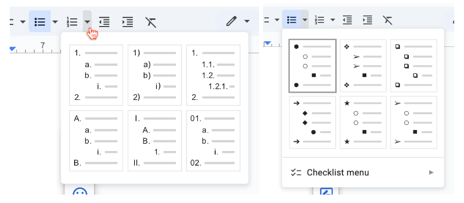
- Use real bullet points by using the options in the toolbar of your document tool.
- Use appropriate spacing to break up the text.
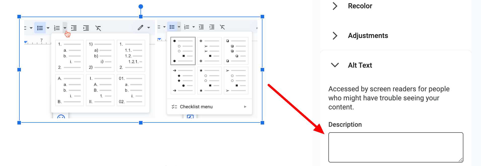
- If you use images, always include proper ALT text.
- Tables should be used only for data, such as your grading scale or exam schedule, not for content formatting. When using tables, always designate a table header row or column to help screen reader users understand the table's structure. Instead of hearing a string of disconnected data, users get context, such as which column a number belongs to—making the information easy to follow and meaningful.
Watch and listen to this example.
-
Choose accessible, readable fonts like Arial or Calibri. Keep fonts at a legible size. Body text should be at least 12 points (pt), or around 16 pixels (px), with no text being smaller than 9pt (12 px).
-
In addition to, or in lieu of, a hard copy, provide a digital version in an accessible format, such as MS Word or a tagged PDF.
Highlight Support Resources
List campus resources like the disability services office, mental health counseling, tutoring centers, and affinity groups. Make it clear that seeking support is encouraged.
Be Flexible and Transparent
State your willingness to accommodate different needs. Let students know they can reach out to discuss challenges they may face with deadlines or course materials.
Creating a syllabus can feel like a chore. But if you approach it with accessibility in mind, it becomes something far more impactful.
A thoughtfully designed, accessible syllabus is more than just compliance; it's a commitment to fostering a classroom where every student feels empowered to learn and succeed.
Resources
- How Do I Write an Inclusive Syllabus?
- Syllabus Accessibility: 4 Essential Considerations
- Universal Design for Learning (UDL) and the Syllabus
- Creating Accessible Documents (Microsoft Word) - Headings
A human author creates the DubBlog posts. The AI tool Gemini is sometimes used to brainstorm subject ideas, generate blog post outlines, and rephrase certain portions of the content. Our marketing team carefully reviews all final drafts for accuracy and authenticity. The opinions and perspectives expressed remain the sole responsibility of the human author.
